Building an expert system for image feature recognition
Overview
Teaching: 60 min
Exercises: 55 minQuestions
What is an expert system?
Which data are we going to use?
How can I download my brain into the computer?
Objectives
Create a signal detection algorithm for sunquakes given time-distance images
Building an expert system
Task background
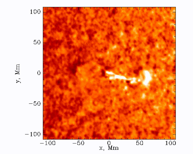
Observations with the Solar Dynamics Observatory (SDO) Helioseismic and Magnetic Imager (HMI) are used to track the movement of waves within the Sun that result from sunquakes.
When a solar flare occurs it releases energy down toward the surface (photosphere) of the sun, which then causes waves to propagate through the solar interior. This is a sunquake. As the waves move through the sun the density gradient causes them to diffract back to the surface of the sun.
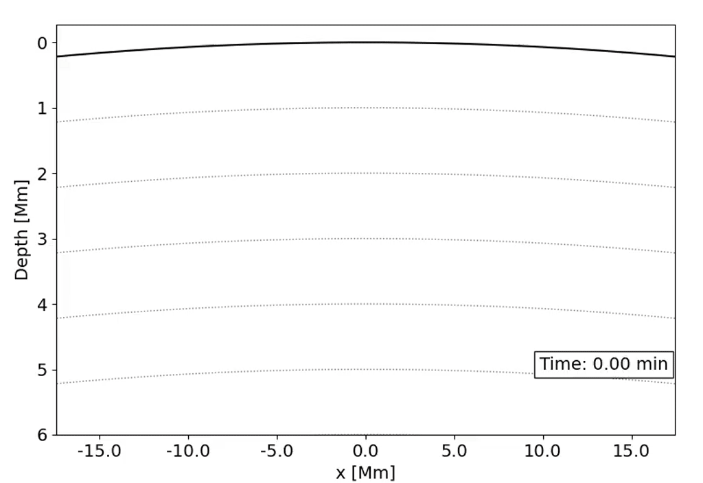
We can’t see the interior of the sun directly, and the chromosphere (where the flares originate) is transparent. What we can see, though, is the propagation of waves on the surface of the Sun via doppler imaging.
The data set that we’ll be working with today is constructed by taking this 3D (time + 2D space) dopplergram and turning it into a 2D image using the following scheme:
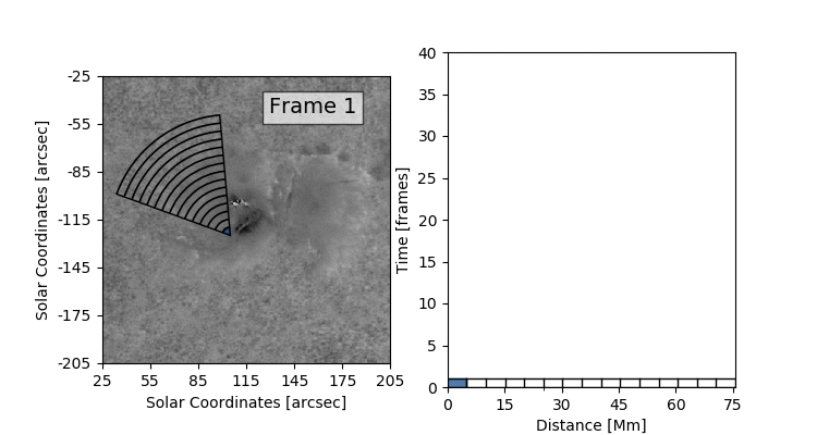
Thus the images that we are dealing with have a distance axis which is a radial distance from some center point at which the solar flare energy is expected to impact the photosphere.
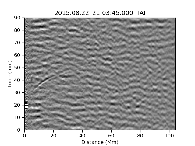
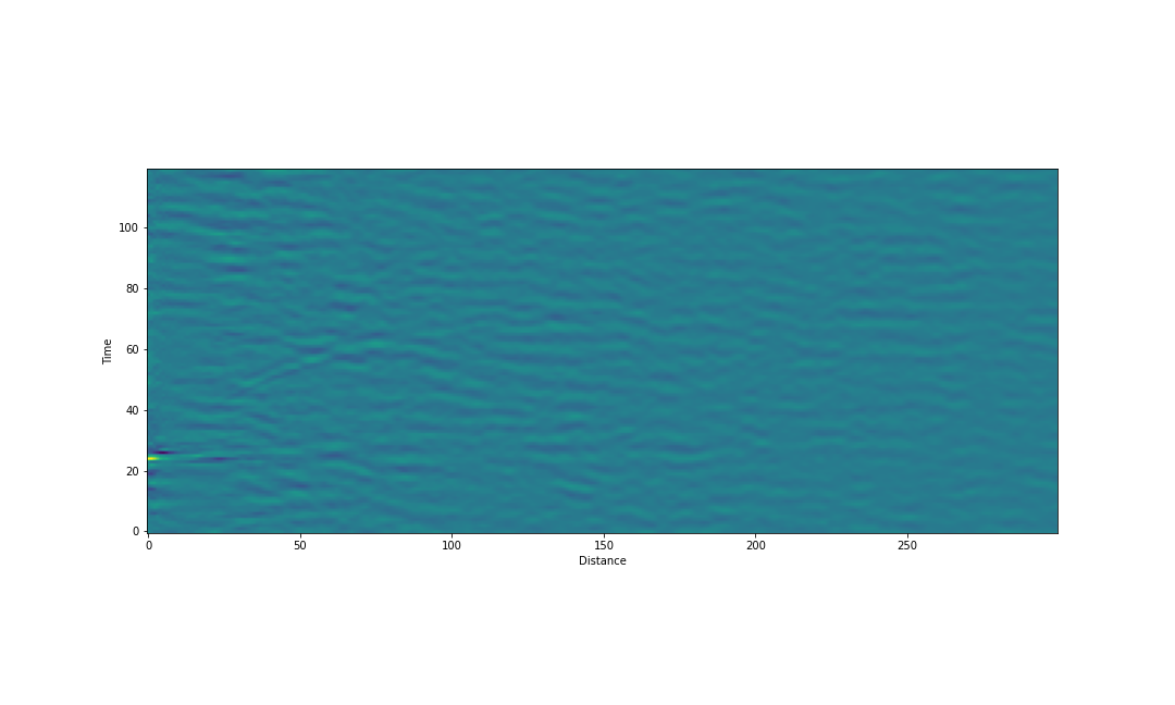
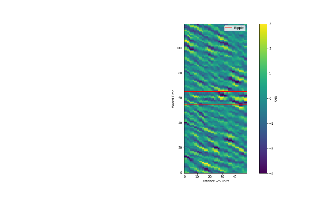
Our task is to search these images and look for a ripple structure that represents the pressure waves from a sunquake. An example time-distance image is shown below.
Workshop goals
In this workshop we will design and old school class of AI (Artificial Intelligence) - an expert system. This system will be designed to replicate the analysis process conducted by an expert who is familiar with the data and the task at hand. As such, we’ll first be doing some work manually to understand what features of the images are important to the task, and then doing some computing work to design a system that replicates our HI (Human Intelligence).
We will be focusing on determining:
- If a given image contains a signal of interest
- Whereabouts in that image ths signal is located
We will then discuss how we can turn the above detection algorithm into one which also characterizes the signals of interest, however we will not implement this characterization system.
Setup our session
We are going to be using Jupyter notebooks to explore our data and design our algorithm. Once we have an algorithm we are happy with we could then create a standalone program that runs from the command line, but Jupyter notebooks are a much better place for us to work and explore during this phase of development.
You can run Jupyter from the command line via:
jupyter lab
Alternatively, you can use Google colaboratory to run notebooks directly from your Google Drive.
Finally, you can use the Jupyter extension to VSCode to run Jupyter notebooks directly in your VSCode editor.
Start a new notebook
Using one of the three methods above, create a new notebook and run the following code to import the libraries that we’ll be working with today.
%matplotlib inline
# builtins
import os
from glob import glob

# 3rd party libraries
from astropy.io import fits

import matplotlib
from matplotlib import pyplot as plt

import numpy as np
from numpy import random

import pandas as pd

import scipy
from scipy.stats import zscore
ImportError
If you get an import error for any of the above libraries it means that you haven’t installed the library yet. The libraries required for this session are outlined in the Setup lesson and in (requirements.txt).
You can install libraries directly from your jupyter notebook with a code cell like this:
!pip install numpy
Copy the data that we’ll be using
In this session we’ll be skipping the data collection and preparation stage and instead download some ready made data.
Download the data
Download and unzip the following file into a directory called ‘data’. https://adacs.org.au/wp-content/uploads/2024/05/Data.zip
You should see a bunch of
.fitsimages with names like:TD_20110730-M9_3.fits TD_20111225-M4_0.fits TD_20120305-M2_1.fits TD_20120705-M1_6.fits TD_20121023-X1_8.fits TD_20130113-M1_0.fits TD_20130422-M1_0.fits TD_20130817-M3_3.fitsThere are also
.pngversions of these images, and a directory calledpart2which we’ll get to later.If you have trouble downloading or unzipping the data please raise a hand or put up a red sticker.
An example of the data that we’ll be working with is shown below:
Load and view our data
In order to work with the image data we’ll need to load it and view it in our notebook.
Load and view an image
- Select the image ‘TD_20110730-M9_3.fits’
- Load this image using the
fits.open()function and assign it to the variablehdu- Extract the image data using
data = hdu[0].data- Use the following code snippet to view the image:
fig, ax = plt.subplots()
ax.imshow(data, origin='lower')
ax.set_xlabel('Distance')
ax.set_ylabel('Time')
plt.show()
Solution
hdu = fits.open('data/TD_20110730-M9_3.fits')
data = hdu[0].data
Detection vs Characterization
I would like to make a distinction between two tasks that are often done in tandem under the guise of “fitting” but which are actually separate tasks. The first task is detection which is asking the question “Is there something here?”. This is what we are going to focus on in today’s lesson. The second task is characterization which is asking the question “Given that there is something here, what does it look like?”. This characterization task is where we determine the parameters of some feature, such as it’s location, strength, shape, etc. and it is in this task that we often perform some kind of “fitting”. We will talk about characterization today but we will not do any. Both detection and characterization require that we have some idea of what it is we are looking for and, more importantly, what we are not looking for. I like to think of this in terms of signal and noise - our task ultimately is to separate our image into parts which we label as signal and parts which we label as noise.
With that out of the way, let us begin making our expert feature detection system.
Manual inspection
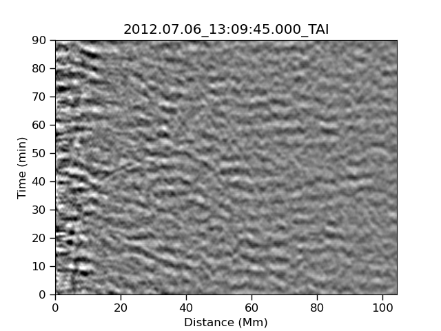
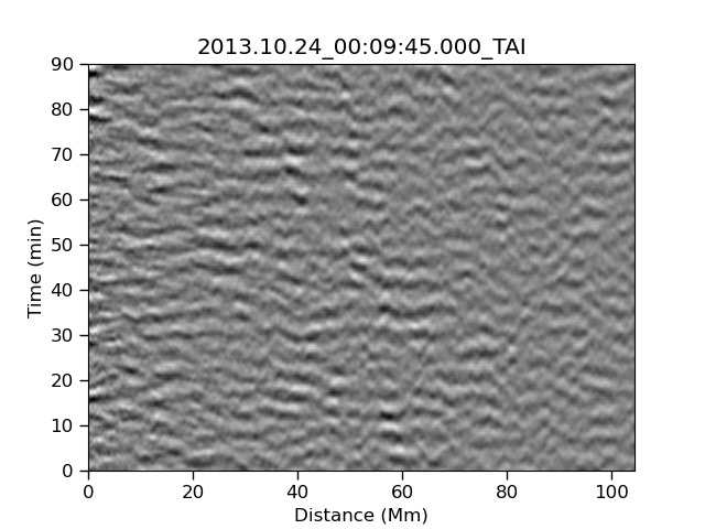
Before we can make some AI we have to understand how our HI works. Let’s start by looking at the following three images which have a combination of signal and noise. The signal that we are looking for is strong or medium in the left and center image, and is not present in the right image.
| Strong | Medium | None |
|---|---|---|
|
 |
 |
What is the “feature”?
Inspect the image above and discuss the following with your fellow learners:
- What is common in all three images and how do you describe it?
- What features are in the first two images and not the third?
- How are the things that you describe in (1) and (2) different from each other?
After you have had some discussion, summarize your notes in the etherpad.
Algorithm planning
Now that we have identified the “feature” (a ripple) in the images above we need to design an algorithm to detect said feature.
A few things to note about the images:
- The ripple is a curved arc which looks to start around 20-30 minutes from distance 0
- Most of the pixels in the image are noise pixels, with only a small fraction being signal pixels
- The background image is filled with waves that are primarily horizontally elongated
- The background waves and the ripple are harder to distinguish at large distances because they are aligned
- The background waves and the ripple are easier to separate at distances around 10-30Mm as the two are misaligned
- There is a region from 0-10Mm were the signal should be easily seen, but it isn’t. This is probably due to what we described in the very first animation. We effectively have a dead-zone where no signal is expected.
- The “wave height” or strength of the waves is different in different parts of the image, with the left of the image sometimes being min/max on the colour scale.
The above observations are going to help us in designing an algorithm which separates the signal of interest (the ripple) from the noise (the other wavy things). The first few steps that we can plan are:
- Normalize the data set so that the noise is roughly equal over the image
- Crop the image to show just the region where the signal is most easily separated from the noise
- Estimate the curvature of the ripple feature by over-plotting the (cropped) image
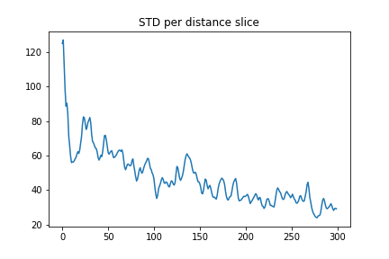
Normalize the data
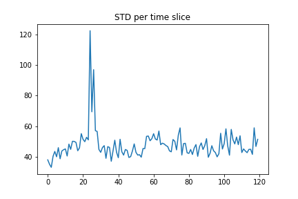
Our data is stored in a numpy array so we can use the data.std(axis=?) function to determine the standard deviation of the data.
Here we can set axis=0 to do the calculation along the time axis so we see the std vs distance.
distance_std = data.std(axis=0)
plt.plot(distance_std)
plt.title("STD per distance slice")
plt.show()
Compute the std along the distance axis
Copy the above code into a notebook cell and execute to see the STD vs distance plot. Then make a new cell which will do the same thing but this time using
axis=1so that we see the STD vs time.
STD plots
Finally, we can removed this variation from the images by subtracting the mean and dividing by the standard deviation. To do this we’ll use the following from scipy:
scaled_data = zscore(data)
If we now replot our image and add a colour bar we get something like the following image. From this point onward we will work in units of pixels and intensity, without converting them to physical units, as this will make the algorithm simpler to write. At some point we will have to care about the physical units (in particular when we do characterization), but we can do without for now.
fig, ax = plt.subplots(figsize=(15,9))
im = ax.imshow(scaled_data, origin='lower', vmin=-3, vmax=3)
fig.colorbar(im, ax=ax, label="SNR")
ax.set_xlabel('Distance')
ax.set_ylabel('Time')
plt.show()
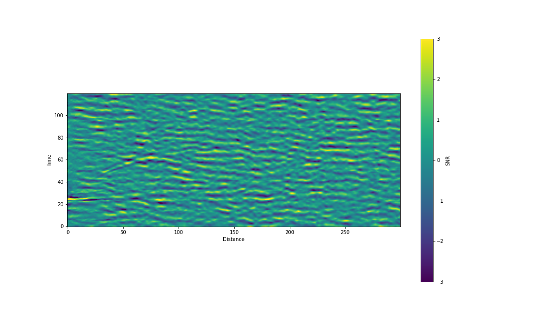
In the above image the color scale has been cropped to \(\pm 3\sigma\). Compared to the original image we have:
- Reduced the prominence of whatever is going on at time \(\sim 20\) and distance \(\sim 0\)
- Increased the prominence of the ripple in the regin around distance \(\sim 50\)
At this point we can make a new observation - the signal seems to follow a \(t \sim \sqrt{d}\) relation starting at \(d=0\) and \(t=\sim25\).
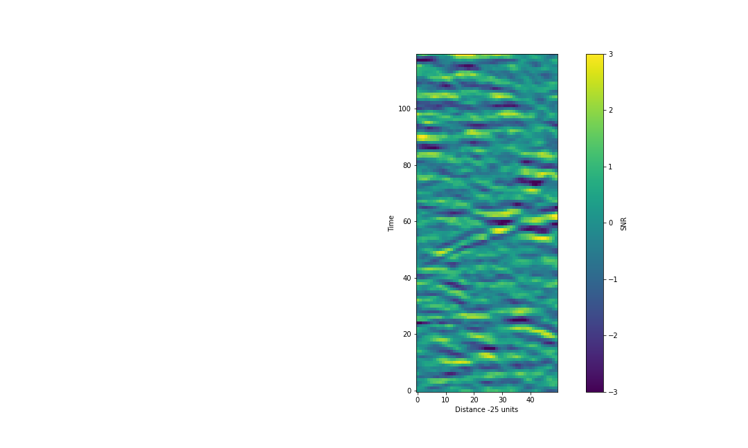
Since our signal is distributed over multiple pixels, we could sum along the path of the signal, and hopefully the signal will accumulate while the noise will cancel out (regression to the mean). This is a standard approach and relies on the signal having some coherence over the summation whilst the noise does not. Since the signal is only really visible in some of the plot we shouldn’t do this sum over the entire arc of the ripple, thus we’ll crop our image first.
Crop image and identify the path of the ripple
To focus only on the section of the image which has the best SNR, we’ll crop our data. I suggest the following:
cropped_data = scaled_data[:,25:75]
Parameterise the t vs d relation
Using the following snippet as a starting point, determine the relationship between time and distance (in pixel coordinates).
#Add lines +/-2.5 pix around the feature for highlighting
distance = np.arange(cropped_data.shape[1])
ax.plot(distance, <my guess function> +2.5, lw=2, color='red', label='Feature of interest')
ax.plot(distance, <my guess function> -2.5, lw=2, color='red')
Once you have a relationship between t and d post your best result in the etherpad.
My example is below:
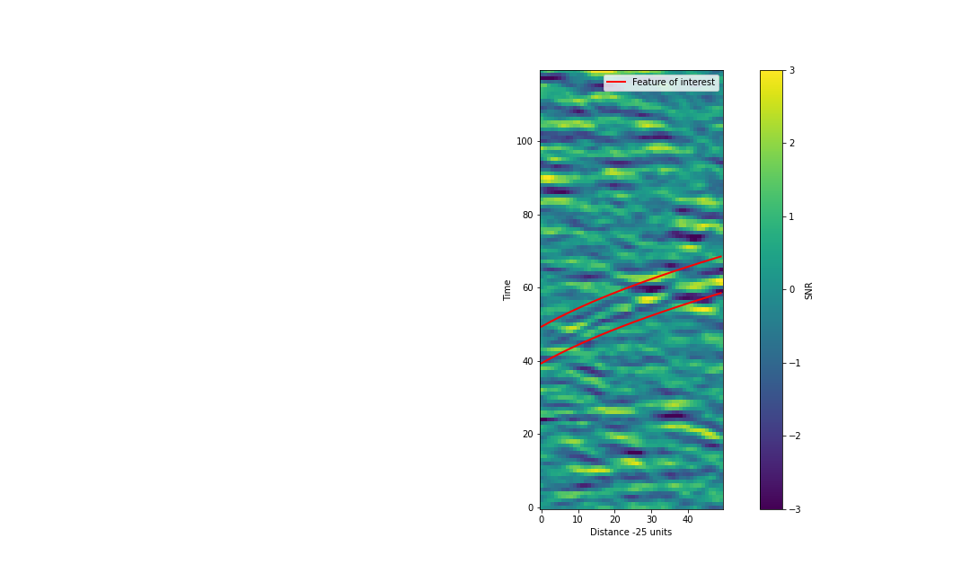
My function
times = 5*(distance+20)**0.5+22
Now that we have a description of what the relationship is we can sum along that line.
Unfortunately our data are organized in orthogonal axes of time and distance but we want to look along a path with is some combination of the two.
We can get around this problem by projecting our data so that the signal of interest is parallel to one of our axes.
To do this we take our function from above and shuffle each of the columns downward so that our curved ripple becomes a horizontal line.
In this process we’ll be shuffling the entire image which means that the current horizontal waves which are the noise will become curved.
Thus if we want to sum along our path we can use np.sum(axis=?) and get a nice profile of our potential signal.
Reproject the data and aggregate
We’ll shuffle the data along the time axis, one slice at a time, using the np.roll() function.
This will take care of all the boundary problems that we might have.
distances = np.arange(cropped_data.shape[1]) # An array of distance values (pixels)
times =  # your function from above
offsets = np.int64(times)  # Convert to integers so we can use as an index

rolled = cropped_data.copy()  # copy data incase we make a boo-boo
mid = cropped_data.shape[0]//2  # determine the mid point of the vertical axis
for i in range(rolled.shape[1]):
    rolled[:,i]=np.roll(rolled[:,i],
                 -offsets[i] + mid)  # Cause our signal to lie in the middle of our plot
With the above implemented we should see something like the below:
Now if we sun across the distance dimension we should be able to accumulate the signal and wash out the noise.
summed = rolled.sum(axis=1)  # Sum over distance

# plot
fig, ax = plt.subplots()
ax.plot(summed)

# add lines to draw attention
ax.axvline(mid+5, lw=2, color='red')
ax.axvline(mid-5, lw=2, color='red')

ax.set_xlabel('Warepd Time')
ax.set_ylabel("Sum over distance")
ax.set_title("Summed data")
plt.show()
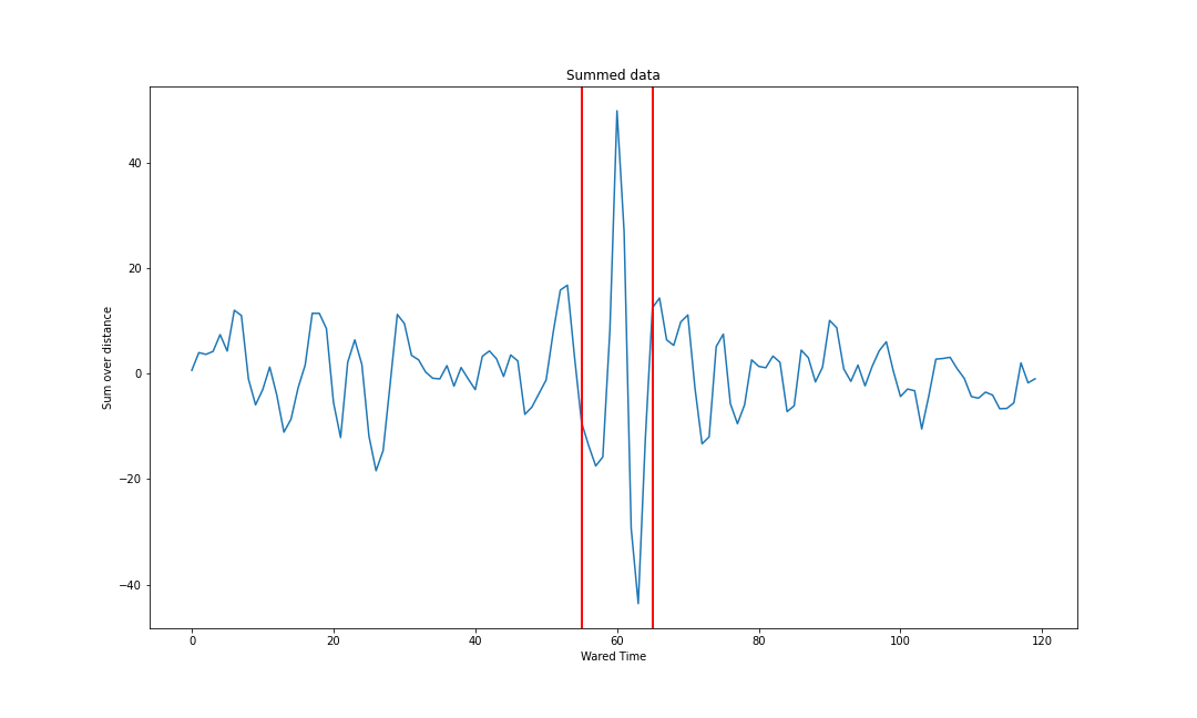
Within the red bars above we see a fairly impressive signal that is different from anything outside the red bars.
We can determine the location of this potential signal by looking at the max value and location:
peak_val = np.max(summed)
peak_index = np.argmax(summed)
print(f"Peak of {peak_val:5.2f} found at {peak_index}")
What next?
- We just looked for the max value in our summed data plot, but our signal has a clear signature. How can we increase our ability to find this signature and be less likely to hit a random noise peak?
- The location of the feature is determined as the index of the maximum pixel. How could we get a location that is more accurate than this 1 pixel resolution?
- Our shuffle/roll method takes a smooth function of t vs d, and rounds the values to
ints so that we can do the roll withnumpy. How might we make this projection step smoother to further enhance our signal once we sum along the distance axis?- What other defects or possible improvements can you identify in our work so far?
Discuss some ideas with your peers and add some suggestions to the etherpad
Creating a signal detection metric
What we would really like to have is a single metric that we can use to determine if there was a detection or not. With some modification to our above method we can do this.
For example, we are not looking to characterise our signal, so it’s strength is un important to us onlt it’s presence. We have already normalised the data set once, so there isn’t any harm in repeating this again.
Instead of using the sum of our data we can use the mean instead:
d_stat = np.mean(rolled, axis=1)
Recap and consolidation
Let us recap what we have done so far in the form of some functions that will allow us to reproduce our work easily:
Our functions
def read_scaled_data(filename: str):
    """
    Read and scale data from the given filename.

    Parameters
    ----------
    filename : str
        File to open

    Returns
    -------
    hdr, data : fitsheader, np.ndarray
        The fits header and the image data.
    """
    img = fits.open(filename)
    data = zscore(img[0].data)
    return img[0].header, data


def crop_data(img, start=25, step=50):
    """
    Crop the image data using default options

    Parameters
    ----------
    start, step : int
        The start point of the crop and the size

    Returns
    -------
    start : int
        The offset into the array for the crop

    data : n.ndarray
        The cropped data
    """
    return start, img[:,start:start+step]


def get_time_offsets(distances, zeropoint):
    """
    Calculate the time offsets according to our relation

    parameters
    ----------
    distances : np.array
        An array of distances (indexes)

    zeropoint : int
        An offset for our function in the case that we are working
        with cropped data

    returns
    -------
    times : np.array
        An array (of ints) which are the time offsets
    """
    times = 5*(distances+zeropoint)**0.5
    return np.int64(times)


def roll_data(data, offsets):
    """
    Shuffle the data according to the given offsets to (hopefully)
    make the signal of interest more prominent

    parameters
    ----------
    data : np.ndarray
        2d image data

    offsets : np.array
        An array of ints which are the offsets to be applied

    returns
    -------
    rolled : np.ndarray
        The shuffled data
    """
    rolled = data.copy()
    for i in range(rolled.shape[1]):
        rolled[:,i]=np.roll(rolled[:,i], -offsets[i])
    return rolled
With our above functions we can then look at the detection metric for all the files in our data directory.
Combine the whole workflow together into a single function
Combine all the above functions together to complete the following function
def process_file(fname):
    """
    Compute our detection metric on the given file

    parameters
    ----------
    fname : str
        Filename to load

    returns
    -------
    best_stat : float
        The maximum of the detection statistic
    """
    hdr, data = read_scaled_data(fname)

    ...

    return best_stat
Suggested solution
def process_file(fname):
    """
    ...
    """
    hdr, data = read_scaled_data(fname)

    zeropoint, cropped_data = slice_data(data)

    distances = np.arange(data.shape[1])

    t_offsets = get_time_offsets(distances,zeropoint)

    if flip:
        cropped_data = cropped_data[::-1,:]
    cropped_data = roll_data(cropped_data, t_offsets)

    d_stat = np.mean(cropped_data, axis=1)

    best_stat=np.max(d_stat)
    return best_stat
With this all in one handy fucntion we can now easily apply our workflow to all the files in our data directory.
Compute the detection statistic for all the files
Use the following code to apply our
process_file()function to all the files that we have been provided:files = glob('data/*.fits') fnames = [] stats = [] for f in files: basename = os.path.basename(f) # Filename without the path best_stat = process_file(f) fnames.append(basename) stats.append(best_stat) # save to a data frame results = pd.DataFrame({'filename':fnames,'stat':stats})
Plotting our solution
fig, ax = plt.subplots()
ax.plot(results['filename'], results['stat'])
ax.set_xlabel("Dataset")
ax.set_ylabel("Detection Statistic")
ax.set_title("Detection stat for all files")
ax.set_ylim([0,1.5])
plt.xticks(rotation=90)
plt.show()
We now have a number for each of our files resulting in the following plot.
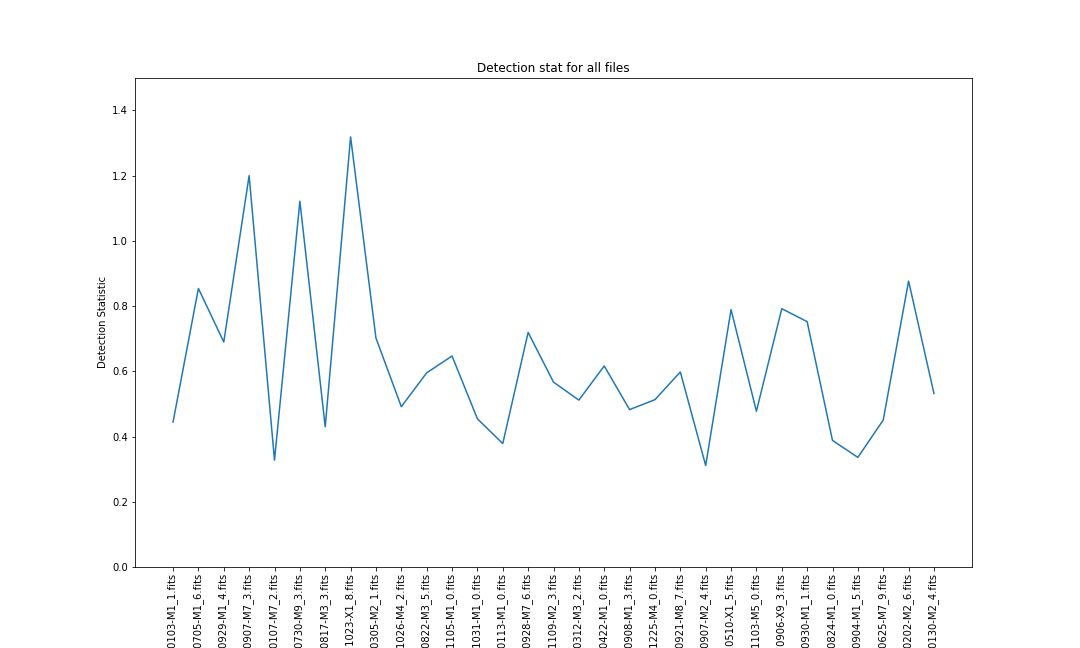
Discuss
- Which of the above files have the feature of interest?
- At what level of detection statistic do we decide that we have a detection?
Discuss among yourselves and add some notes to the etherpad
Determining signal vs noise
What we really need here is an example of data that has only noise but no signal. There are a couple of ways that we can do this:
- Obtain new data that has no signal
- Simulate new data that is just noise
- Remove or obscure the signal in our existing data
Of the above: (1) could be costly as it could require extra observations, or time consuming because we have to process a lot more data, (2) is only effective if we have a really good understanding of the noise which can be as difficult as understanding the signal itself.
Let’s investigate option 1 and then we’ll come back to option 3.
Within our data/part2 directory there is also a set of files in which and expert has determined there is no signal present.
Process all the files in the part2 directory
Based on the code above:
- compute the detection statistic for all the files in the
data/part2directory- save the results in a data frame called
nullresults- plot the results
The null results are helpful but with only a few examples we aren’t really getting a good measure of what noise looks like.
Hiding our signal
Our signal of interest has a particular shape within our data. We don’t need to completely remove the signal from our data, but we need to hide it from our algorithm. Understanding what our signal looks like and how our algorithm works gives us an advantage here.
Our signal follows a roughly \(t \propto \sqrt{d}\) relation and we shift all our data to account for this. If we were to invert our data along the time or distance dimension and perform the same shifting, then we will mix our signal in the same way that we mix the noise. Let’s try this out now.
Modify the proces_file function
Modify the function so that:
- it has an optional parameter
flipand is default set toFalse- if the
flipparameter isTruethen the data will be inverted after reading (either time or distance axis)- all other processing should then proceed as normal.
My solution
def process_file(fname, flip=False):
    """
    Compute our detection metric on the given file

    parameters
    ----------
    fname : str
        Filename to load

    flip : bool
        If true then flip the data before processing
        Default = False

    returns
    -------
    zeropoint : int
        The offset into the dataset that we are

    best_stat : float
        The maximum of the detection statistic
    """
    hdr, data = read_scaled_data(fname)

    zeropoint, cropped_data = crop_data(data)

    distances = np.arange(data.shape[1])

    t_offsets = get_time_offsets(distances,zeropoint)

    if flip:
        cropped_data = cropped_data[::-1,:]  # Flip along time axis
    cropped_data = roll_data(cropped_data, t_offsets)

    d_stat = np.mean(cropped_data, axis=1)

    best_stat=np.max(d_stat)
    return best_stat
Now we can re-run our processing as before but with the flipped data to see what a detection stat is measured when there is no signal.
def get_results(flip=False):
    files = glob('data/*.fits')
    fnames = []
    stats = []
    for f in files:
        basename = os.path.basename(f)
        best_stat = process_file(f, flip=flip)
        fnames.append(basename)
        stats.append(best_stat)
    results = pd.DataFrame({'filename':fnames, 'stat':stats})
    return results

results_flipped = get_results(flip=True)
Plotting code
fig, ax = plt.subplots()
ax.plot(results['filename'], results['stat'], label="Feature")
ax.plot(results_flipped['filename'], results_flipped['stat'], > label="No Feature")
ax.hlines(threshold, xmin=ax.get_xlim()[0], xmax=ax.get_xlim()[1], color='red', label='3σ detection threshold')
ax.set_xlabel("Dataset")
ax.set_ylabel("Detection Statistic")
ax.set_ylim([0,1.5])
plt.xticks(rotation=90)
ax.legend()
plt.show()
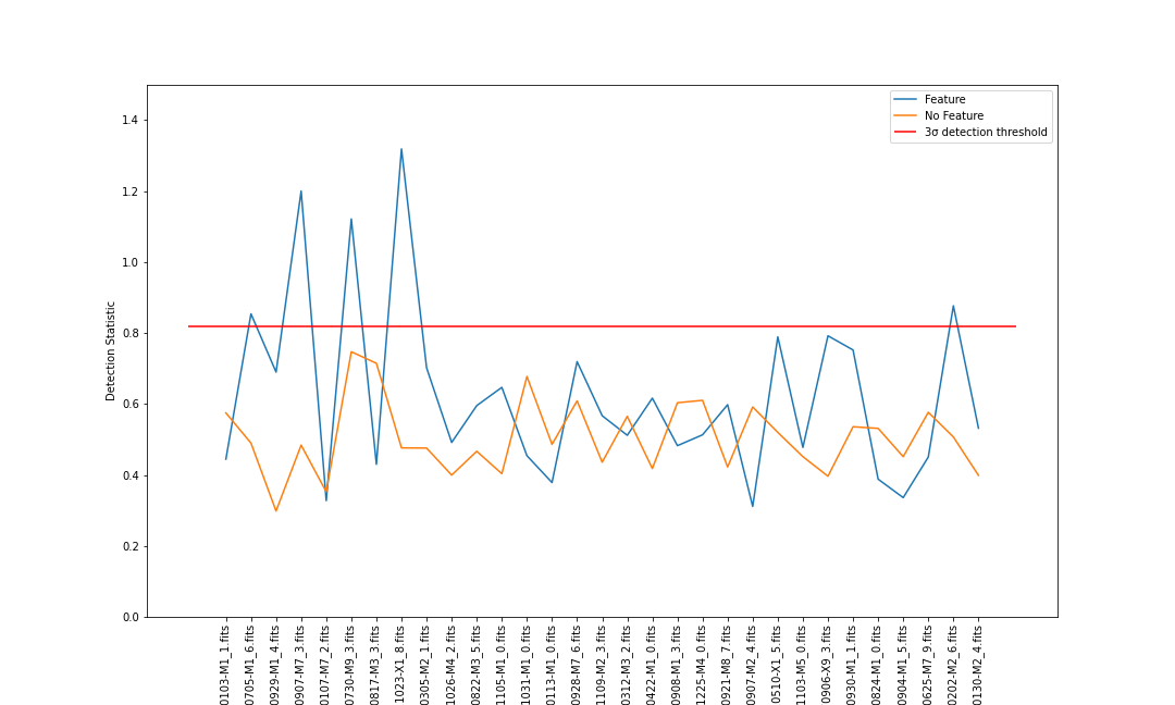
Discuss
- Which of the files have a detection according to our algorithm?
- Have a look at the
.pngfiles that included with the data and see if you agree with these detections and non-detections.
Optional extra
- Measure the effectiveness of our detection algorithm vs your own ability
- TODO (accuracy, recall, etc)
Future work
We have a detection algorithm that works ok. It could easily be better if we spent some more time crafting it, but for a few hours of work we have done rather well.
Some suggestions for improvements are:
- Obtaining or craating higher resolution images
- Determinig the t vs d relation more accurately (based on physics, using real units)
- Using interpolation to make the re-projection step more accurate (recall we rounded to the nearest int)
- A larger data set for training both the detection vs not-detection scores
- Using more than a single point of reference in the image (multiple crops)
Wrap up
Using the etherpad make some notes about other ways that you would suggest improving the algorithm. If you have ideas about python packages or functions that might be useful then note them down as well.
Key Points
Writing an expert system is best done in collaboration with experts
Break a task down into it’s most basic components and replicate them individually
Our visual system is amazing so don’t be sad if it takes you a long time to get 1/2 good results from your code
An alternative to an expert system would be some Machine Learning algorithm, however we still need and expert to help guide the training process