Building a machine learning model for time-series data forecasting
Overview
Teaching: 90 min
Exercises: 60 minQuestions
What is our goal?
Which data are we going to use?
Objectives
Understand the task goal and obtain the relevant data
Machine learning task
Machine learning is a type of AI in which we don’t explicitly code our algorithms, but instead teach them by showing examples of input and output, and letting the algorithms learn the relation between them. The algorithms that we use have already been constructed to be of general use and to be able to learn, it is up to us to tach them wrong from right.
There are many different machine learning algorithms, many classes of machine learning, and different ways to train an ML. The art of machine learning, of being a good data scientist, is to be able to take a given data set and desired outcome and select and train an appropriate algorithm. In reality there is no super magic to this and we engage in a little bit of ‘try many things and choose the best’.
The normal machine learning workflow is as follows:
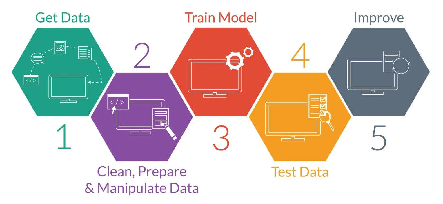 credit:medium.com
In order that we can complete our lesson within the given time we are going to work with some pre-made data (skipping steps 1+2), and train only a single model. We’ll leave the improvements (step 5) for future work.
Our task
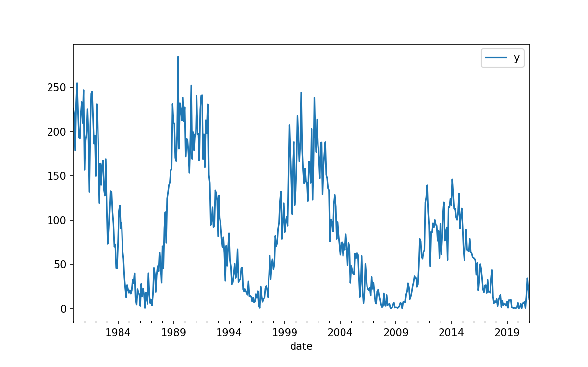
In this lesson our aim is to use historical data to predict the value of future data. Specifically we’ll be predicting future sunspot activity.
As can be seen below there is a very long history of tracking these data, that there is some cyclic behavior, and that there are a few deviations to the “usual” cycles. All up this makes for a very interesting data set. We are going to focus on a forecasting the sunspot numbers up to 1 year in advance, and we’ll only be using data from after the Dalton Minimum.
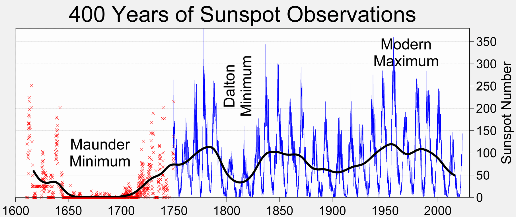 credit:wikipedia
Setup our session
We are going to be using Jupyter notebooks to explore our data and design our algorithm. Once we have an algorithm we are happy with we could then create a standalone program that runs from the command line, but Jupyter notebooks are a much better place for us to work and explore during this phase of development.
You can run Jupyter from the command line via:
jupyter lab
Alternatively, you can use Google colaboratory to run notebooks directly from your Google Drive.
Finally, you can use the Jupyter extension to VSCode to run Jupyter notebooks directly in your VSCode editor.
Start a new notebook
Using one of the three methods above, create a new notebook and run the following code to import the libraries that we’ll be working with today.
%matplotlib inline
import matplotlib
import matplotlib.pyplot as plt

import numpy as np

import pandas as pd
from pandas.plotting import lag_plot, autocorrelation_plot

from sklearn.model_selection import TimeSeriesSplit
from sklearn.metrics import mean_squared_error

import statsmodels
import statsmodels.api as sm
from statsmodels.graphics.tsaplots import plot_acf, plot_pacf
from statsmodels.tsa.ar_model import AutoReg
from statsmodels.tsa.stattools import pacf
ImportError
If you get an import error for any of the above libraries it means that you haven’t installed the library yet. The libraries required for this session are outlined in the Setup lesson and in (requirements.txt).
You can install libraries directly from your jupyter notebook with a code cell like this:
!pip install numpy
Our data set
The file we are looking for is a record of average Sunspot counts per month since 1749. The data has been compiled, calibrated, and aggregated already, and is available on kaggle. To download the dataset we could either register an account on Kaggle or use the kaggle python module.
Use kaggle to download the data
!kaggle datasets download -d robervalt/sunspots
!unzip sunspots.zip
Inspect the data:
,Date,Monthly Mean Total Sunspot Number
0,1749-01-31,96.7
1,1749-02-28,104.3
2,1749-03-31,116.7
3,1749-04-30,92.8
4,1749-05-31,141.7
5,1749-06-30,139.2
6,1749-07-31,158.0
7,1749-08-31,110.5
8,1749-09-30,126.5
9,1749-10-31,125.8
10,1749-11-30,264.3
...
3254,2020-03-31,1.5
3255,2020-04-30,5.2
3256,2020-05-31,0.2
3257,2020-06-30,5.8
3258,2020-07-31,6.1
3259,2020-08-31,7.5
3260,2020-09-30,0.6
3261,2020-10-31,14.4
3262,2020-11-30,34.0
3263,2020-12-31,21.8
3264,2021-01-31,10.4
The first (un-named) column is the row index.
Read data with pandas
- Use
pd.read_csvto read our data using the column names ofindex,date, andy.- Drop the
indexcolumn as we won’t be working with it.- Convert the
datecolumn fromstringintodatetimeformat and use it as our table index.- Remove the
datecolumn as we won’t need it anymore.- Set the dataframe frequency to be months (‘M’)
- Crop out all the data before 1820
My solution
def load_data():
    # load our data and set up our data frame to be easily used
    data = pd.read_csv("Sunspots.csv", names=['index','date','y'], header=0)
    data = data.drop(columns='index') # drop the row numbers
    data.index = pd.to_datetime(data['date'])  # Convert the date column into datetime object and use it as our index
    data.drop(columns='date', inplace=True)  # Delete the date column
    data = data.asfreq('M')  # Tell pandas that the data have a cadence of months
    data = data['1820':]  # use only data after the Dalton Minimum
    return data

data = load_data()
Run a cell with just data in it to inspect the data frame.
It should look something like this:
date           y
1820-01-31   32.0
1820-02-29   44.4
1820-03-31   7.5
1820-04-30   32.3
1820-05-31   48.9
...          ...
2020-09-30   0.6
2020-10-31   14.4
2020-11-30   34.0
2020-12-31   21.8
2021-01-31   10.4
2413 rows × 1 columns
Use the following plotting template
We will be plotting our data many times in this lesson so we’ll use the following template.
fig, ax = plt.subplots()
ax.plot(data)
ax.set_xlabel('Date')
ax.set_ylabel('Mean monthly spot counts')
#plt.savefig('Data.png')
plt.show()
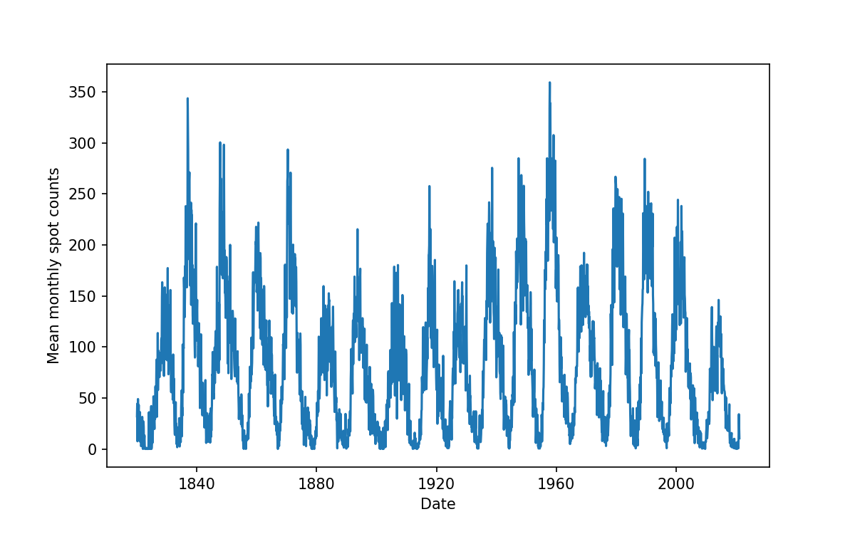
We are going to be using some ML methods to learn from this data and predict new data into the future. First we’ll learn a little about the method we are going to be using.
ML methods
Machine learning has a number of classifications. Today we’ll be employing supervised learning to train a regression model. Supervised learning means that we have examples of right and wrong answers to test our trained models against. Regression means that we’ll be predicting numerical answers for some given input. The particular method that we will be exploring is called an autoregressive model. Autoregressive models predict the next value (regression) in a sequence by taking measurements from previous inputs in the sequence. Our data is a time series of a single value so this is a 1D model that we’ll be using.
As an example of an autogressive model, suppose we want to predict the next value in a sequence using the previous two values as input. The previous two values are often referred to as lags. In the figure below we have a prediction model (the \(f\)) taking two lagged values (\(X_{t-1},~ X_{t-2}\)) as input (and optionally extra data \(\epsilon\)) to produce the prediction of \(X_t\).
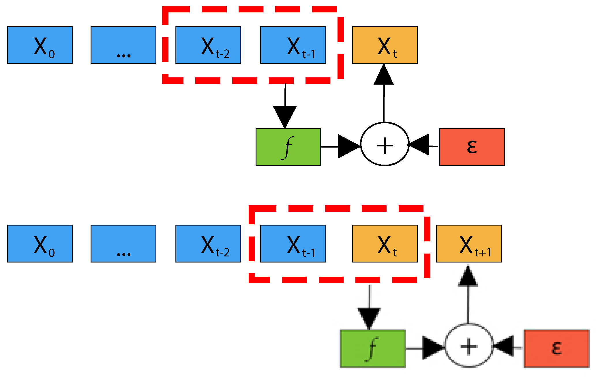 Credit:10.3390/info14110598
Note that in the above diagram the prediction for \(X_{t+1}\) uses the previous prediction as an input. This is a key feature of time-series algorithms, and it means that you can easily end up in a situation where the output is oscillating or growing without bound as the algorithm amplifies prediction errors. One way to avoid this delirious behavior is incorporate additional (exogeneous) data into the prediction. This is not within the scope of our lesson for today.
Lags and auto-correlations
As indicated in the above figure our input data is a lagged version of the data we are trying to predict. If our data had some easily defined periodicity then this would be a simple problem with not much learning to do. E.g. a two body system can be described in a closed analytical form and there is no real learning to to do, we just supply some initial conditions and we are done. However, the Sun is not so simple, there are periods within the data that we can see easily by eye, but there is also a lot of weirdness (a.k.a physics) going on that we don’t completely understand.
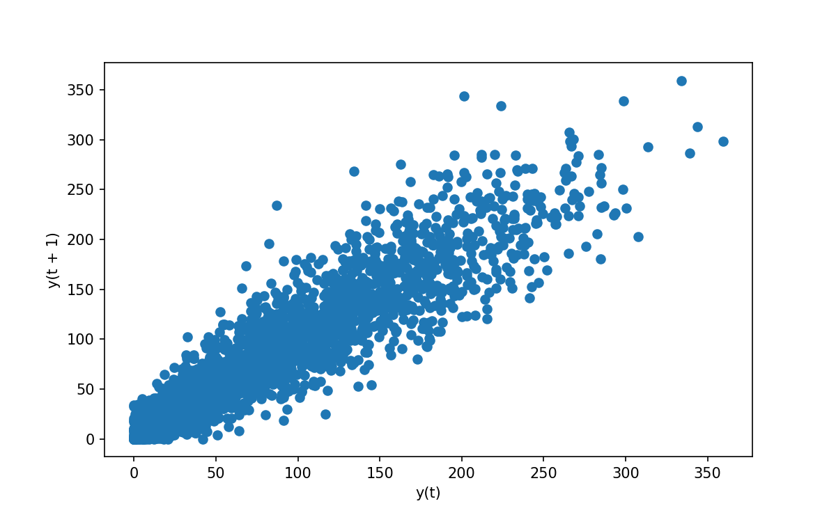
Since we’ll be working with lagged data let us have an explore of what these lags look like. Pandas give us the following convenience function:
# For a correlation of 1 month we see a highly correlated plot
# For other lags we see different degrees of correlation
lag_plot(data['y'], lag=1)
Which gives the following:
Explore different lags
- Re-run the above code with different values of
lagand see what behaviors are present- Describe and discuss the behaviors with your peers
- See if you can explain some of these behaviors
- Make a note of some interesting lags in the etherpad
We can take a more systematic approach to the above and compute the autocorralation of our data.
Using plot_acf(data['y'], lags=150) (this time from statsmodels) will let us see the Autocorrelation for our data, along with some guidelines for significance at the 95% (shaded region) level.
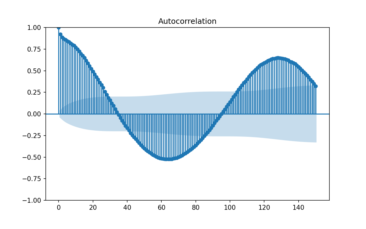
The problem with the above is that each correlation will cause harmonics at integer multiple lags, and have correlations bleeding from one lag into neighboring lags. Since our 1 month lag correlation is so strong all the other potential lags get swamped.
Instead let us plot the partial auto-correlation function, in which each correlation is removed from the data set before computing the next.
Again, thanks to statsmodels, this is easy to do using plot_pacf(data['y'], lags=150).
In the below figure I’ve zoomed the figure to make it easier to see which lags are outside the indicator for 95% confidence.
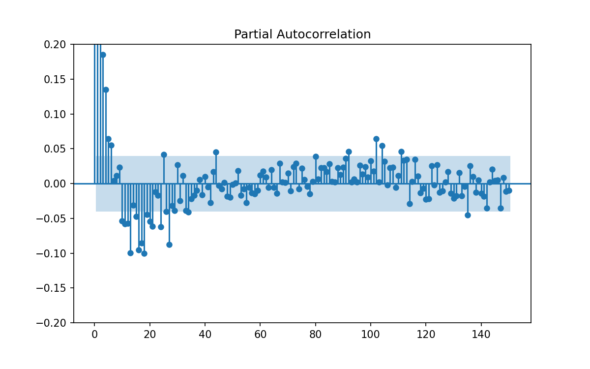
From the above we can see the following:
- There are many lags at which there is significant correlation
- There are many more lags at which thee correlation is much lower
- The pattern to which lags are important or not is not regular so we have to learn from the data.
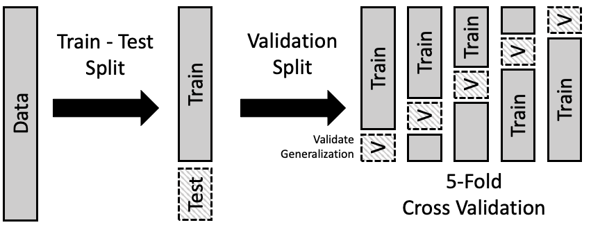
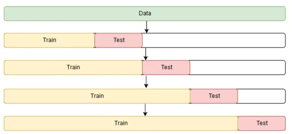
Training, testing, and validation
Now that we have learned about the algorithm that we’ll be using, and had some initial investigations of the data, we need to get serious about the actual learning and training. A key tenant of machine learning (and human learning) is that your testing doesn’t mean anything if you give away the answers beforehand. We are going to train our algorithm, and then test it’s performance on known data, so that we can then infer that these results also apply to unseen data. Thus we want to have a clean, unbiased, best measure, of the model performance so that we aren’t over- or under-estimating it’s usefulness. Additionally, our data is valuable and “getting more data” is either expensive or not possible. Our goal is to predict the mean sunspot counts each month for at least one solar cycle and given that each cycle is 11 years, I don’t want to have to hang around for new data to be collected just to test my model.
The standard practice for ML training and optimal data use is:
- split your data into two parts called train and test,
- use the training data to build your best models,
- keep the test data secret (from the models) and use it to evaluate their performance after training.
With our training data we build a model by choosing some parameters, fitting the model, and then measuring it’s performance. We then update the parameters and redo the train / evaluate loop until we get the best parameters. There is therefore a need to split our training data further into training and validation subsets. There is thus a sort of recursion that is happening here with our data splitting. In order that we can get the best measure of a models performance we average the various metrics over multiple train/validation splits.
The splitting scheme is shown in the figure below:
 credit: learningds.org
Standard practice is to use a 80/20 ratio of train/test data, and between 5-10 splits for the validation sets.
Make test/train subsets of our data
Since time-series data has inherent order and internal correlation we cannot just choose a random 80/20 split. Instead we are going to choose the first/last 80/20% for the splitting. Additionally, for the sake of easy viewing we are going to make the split so that it occurs at the boundary between solar cycles. Thus:
- plot the full solar data set,
- count the number of cycles and choose a number that is approximately 20% of the dataset (rounding down),
- identify a year that we can use to split the data into train/test
- save this year as
split_date(can be a string of just the year)- split your data using:
split_date = ? # your date
train = data[:split_date]
test = data[split_date:]
My solution
I count 18 cycles, so 20% is 3.6 which I round down to 3. Plotting data from 1980 onward I get the below plot and see that there is a minimum around 1986 so i’m going to choose this as my splitting date.
split_date = '1986'
We will work on the validation part at a later stage since it’ll require some more careful thinking.
We do the test / train split now because we don’t want any information leaking from our test data into our model in the form of the choices that we are making about the data processing. All the prelim exploration that we did earlier was working with the full data set, so we shouldn’t make any choices (eg, what lags to use) based on that data.
Training a model
Let us get a baseline for comparison by training a model with limited knowledge and see how we go.
As noted before we are going to use an auto-regressive model.
In particular we’ll use the AutoReg model from the statsmodels module.
Thankfully many of the machine learning modules all use a very similar interface for interacting with their models so the actual process of machine learning can look decptively easy.
Below is a snippet of code which will:
- Create a model with given parameters (in this case a nuber of lags)
- Train (fit) the model on our data
- Use our trained model to predict future data
- Measure the performance of the model
- Plot the results.
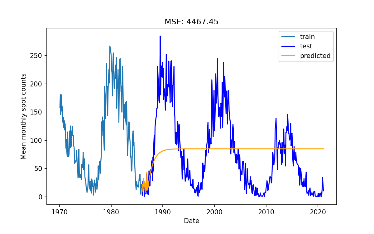
# Train model and make predictions
model = AutoReg(train, lags=1)
results = model.fit()

# Predict into the future for the duration of the test data
pred = results.predict(start = test.index[0], end=test.index[-1])

# Evaluate model performance
score = mean_squared_error(test, pred)

# plot the results
fig, ax = plt.subplots()
ax.plot(train['1970':])
ax.plot(test, color='blue', label='true')
ax.plot(pred, color='orange', label='predicted')
ax.set_xlabel('Date')
ax.set_ylabel('Mean monthly spot counts')
ax.set_title(f"MSE: {score:.2f}")
plt.show()
In the above we have used the mean squared error as a measure of the model performance. This is the mean of the (data-model) squared.
As you can see, the model fitting and predicting is just 3 lines of code, evaluating the model is 1 line, and plotting is 8 lines.
Evaluate my model
How do you think the model performed?
Experiment with different values of
lagand see if you get better results.If you get better results for higher lags make a note in the etherpad
My quick observations
Using only a few lags causes the model to do “ok” for a few months, and then it will settle on some constant not interesting value like a critically damped oscillator.
Using a larger (>~50) number of lags starts to introduce some periodicity into the predictions but it still looks like a damped oscillator.
Even if we set the lags to be very large (1000) we don’t get better results, in fact we end up with an exponentially increasing oscillating behavior.
Improving our results
Selecting features
The features that we have access to are our data points but with a lag. If we wanted to, we could create new features based on combinations of these lags, differences, averages, variance, etc. However that complicates our processing, so we will not explore this today.
Potentially we have hundreds or thousands of lags we could select from. Each feature potentially adds more signal so you might be tempted to use all the features. However, each feature adds noise, so we should use as few as possible. This is referred to as the curse of dimensionality: too few features and we have not enough signal, too many features and we have too much noise. There is a sweet spot somewhere between the two, and it’s often at a much smaller number that you might think.
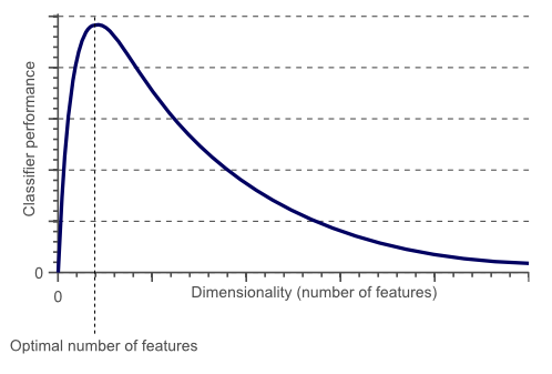 Credit: builtin.com
Because we are working with linear models, and directly with lagged data, the lags that are most likely to be useful are those that correspond to periodicities (or correlations) in the dataset. Let us revisit our investigation of these correlations.
We can use the pacf(data['y'], nlags=?) function to compute all the partial autocorrelations (that were shown in the plot previosly) for lags up to some number.
Since we know that the solar cycle has a period of around 11 years (132 months) we’ll look at all the periods in the data up to at least 132 months and select the strongest.
# Autocorrelation and partial correlation plots for up to 150 lags.
partial = pacf(data['y'], nlags=?)
print(partial)
[ 1.00000000e+00  9.21431263e-01  2.61468947e-01  1.87111157e-01
  1.36507990e-01  6.58880681e-02  5.61757662e-02  4.97585033e-03
  1.19296174e-02  2.41740510e-02 -5.39746593e-02 -5.85780073e-02
 -5.83541917e-02 -1.01599903e-01 -3.26562940e-02 -4.85333902e-02
 -9.75415629e-02 -8.80749512e-02 -1.03359047e-01 -4.68672061e-02
...
  1.75795932e-02 -1.53937744e-02 -2.33902396e-02 -1.98993491e-02
  1.54703200e-02 -1.94083977e-02 -5.76878487e-03 -5.00392522e-02
  2.49014209e-02  8.86220994e-03 -1.46009667e-02  4.28663884e-03
 -1.59786652e-02 -2.12559594e-02 -4.00213909e-02  3.25161113e-04
  2.00279138e-02  3.48651613e-03  3.74865269e-03 -3.91115819e-02
  7.14413589e-03 -1.40235269e-02 -1.27618828e-02]
The first entry in the list is the zero lag which of course shows a correlation of 1.0. How can we use this information? I see two options:
- Select all the lags with some correlation above a critical value and use them in our model, varying this threshold as a hyperparameter for our model.
- Sort the lags by correlation strength and then use the first N of these lags in our model, varying this N as a hyperparameter of our model.
Since the distribution of the correlation strengths isn’t regular I think that the second approach will yield the best results so we’ll go with that.
A hidden gem of the numpy module is the various np.arg functions which allow you to compute min/max or sort a data set but then return the arguments (indexes) instead of the values.
Thus if we do np.argsort(abs(partial)) we’ll get a list of the arguments (in this case the actual lags) corresponding to the sorted correlation values.
Using this trick we’ll construct a list of the lags in order of potential usefulness. Additionally we’ll do some good commenting to make our 1 line super hack into something more readable.
partial= pacf(data['y'], nlags=150)
all_lags_sorted = list(                   # convert generator to a list
                    reversed(             # reverse the list (returns a generator
                        np.argsort(       # return the arguments of the sorted array
                            abs(partial)  # +/- correlations are equally useful
                        )
                    )
                  )[1:]                   # Chop the first lag (0) as it can't be used in our model
print(all_lags_sorted)
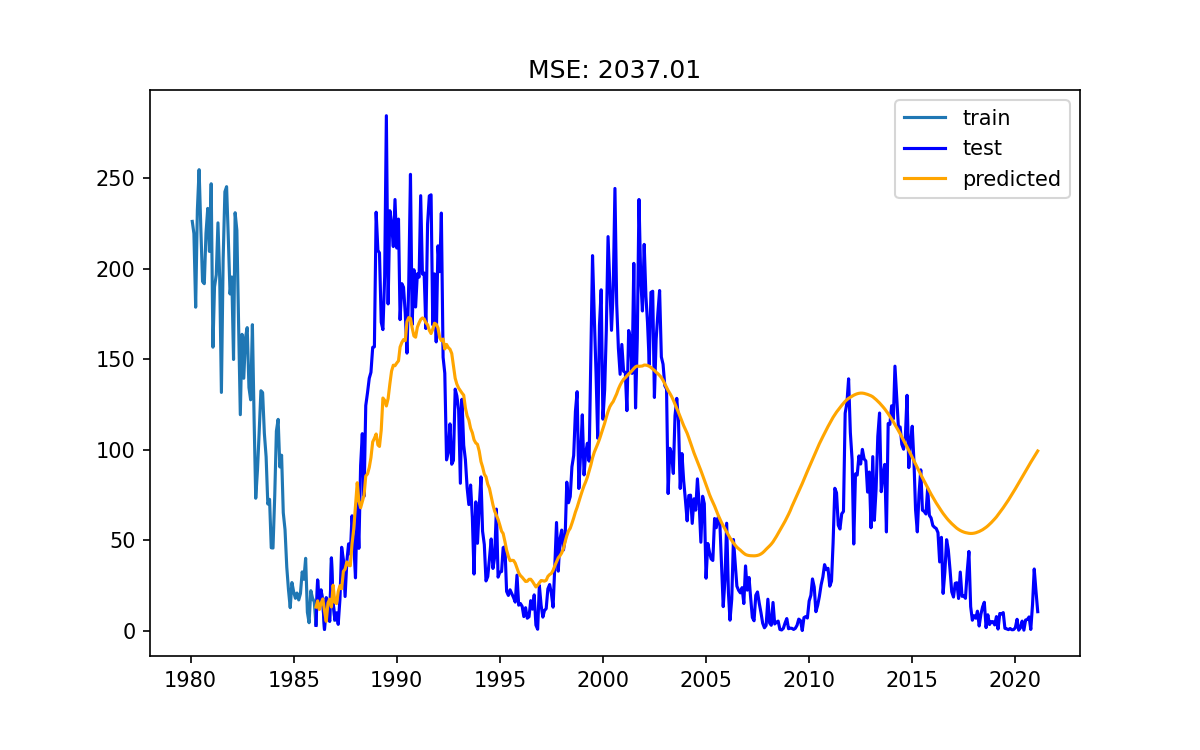
Use the
all_lags_sortedto train a new modelPass
lags=all_lags_sortedinto ourAutoRegmodel, train it, and review the results.It is probably a good idea to copy/paste your previous notebook cell so that you can swap back and forth between the results.
Do your new results look better than the previous ones? Comment in the etherpad
My new model
Adding seasonality
Our data set has a fairly obvious repeating pattern to it - the 11 year solar cycle. Even our best models so far don’t seem to be able to properly understand that seasonality. Seasonality can be thought of as a more generic periodicity which doesn’t need to be some sinusoidal function.
The below code/plot shows a seasonal decomposition:
result = seasonal_decompose(data['y'], model='additive', period=12*11)
result.plot()
plt.suptitle('Seasonal Decomposition of Sunspot data series')
plt.show()
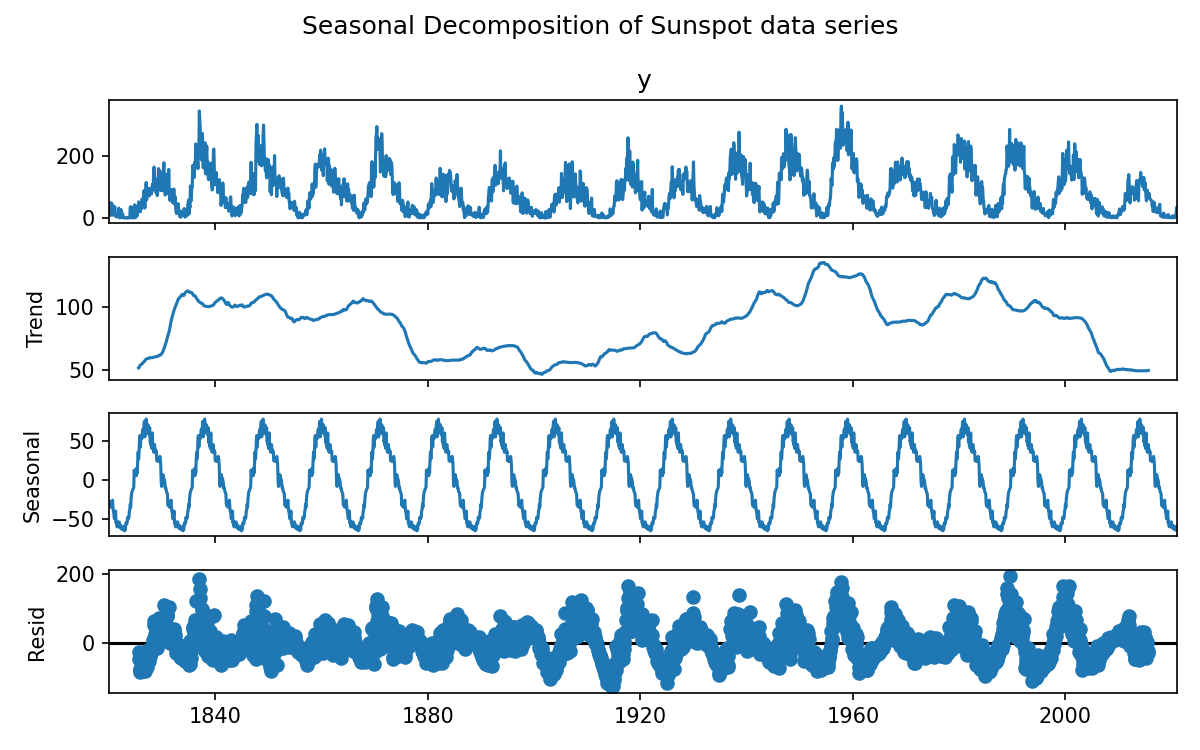
If our model were to understand that there was a repeating seasonal feature in the data set then it should have an easier time making predictions. To incorporate seasonality we need to increase our dimensionality by 1, to include a parameter that tracks the current phase of the season. Alternatively we could find, fit, and then subtract the seasonal component from our dataset, train a model on the remainder, make a prediction, and then add our seasonal component to the prediction.
Include seasonality in our model
Add the parameters
seasonal=True, period=12*11to our model, fit, predict, and plot.Does the predicted data look better than the previous model?
Does the MSE agree with your assessment?
Comment in the etherpad
My model with seasonality
Cross validation
So far we have been doing a lot of model training using all the training data to build the model, and then using the test data to evaluate the model. This is a little bit wrong, because we may make decisions that relied on information from the test data. What we should hav been doing is to use cross validation to evaluate our model, and then look at the test data to see if we are over/under fitting.
Let us now implement some cross validation.
Unfortunately the AutoReg model doesn’t have quite the same behavior as the models provided to us by sklearn so we can’t simply use the cross_validate, and we have to do a bit of home-brewing.
On the other hand, this will help us understand the cross-validation process in more depth.
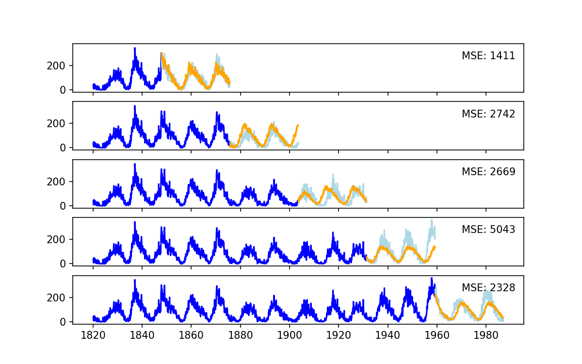
Unlike the cross validation image that we showed earlier (for general use), with time series data we follow a scheme that is more like the following:
Use the following as a template and experiment from there.
# Make a series of splits for the data
tscv = TimeSeriesSplit(n_splits=5)
scores = []
fig, ax = plt.subplots(5,1, sharey=True, sharex=True)

# Train on longer and longer subsets of the data
for i, (train_index, test_index) in enumerate(tscv.split(train)):
    print(f"Training on the first {len(train_index)} samples, testing on the next {len(test_index)} samples")
    train_data, test_data = data.iloc[train_index], data.iloc[test_index]
    # create our model, fit, and predict
    model = AutoReg(train_data, lags=all_lags_sorted[:10], seasonal=True, period=12*11)
    model_fit = model.fit()
    predictions = model_fit.predict(start=test_index[0], end=test_index[-1])

    # evalutate the model and save the score for this split
    mse = mean_squared_error(test_data, predictions)
    scores.append(mse)

    # make some plots so we can see what is happening
    ax[i].plot(train_data, color = 'blue')
    ax[i].plot(test_data, color='lightblue')
    ax[i].plot(predictions, color='orange')
    ax[i].annotate(f'MSE: {mse:.0f}', xy=('1970', 250))

plt.savefig("CrossVal.png")
plt.show()

# this is our score averaged over all the different splints
avg_score = np.mean(scores)
std_score = np.std(scores)

print(f"Scores during cross validatiaon {scores}")
print(f"Summary score is {avg_score:.2f}+/-{std_score:.2f}")
 ]
]
Discuss
Observe the size of the train/test sets during each cross-validation.
What do you notice about the mean/std of the score, and the MES of each of the “splits”?
Discuss with your peers and make notes in the etherpad
Bringing everything together
Now we will bring together all the things that we have learned so far:
- Using an AutoRegressor model
- Selecting the most important lags as features
- Including seasonality in our model
- Cross validation to get a better understanding of the model performance
We will also add a key important step which is an automatic and systematic search for the best parameters for our model. This is referred to as Hyperparameter training and essentially means we need to do a few optimization loops. Whilst we could explore the entire space of lags x seasonal periods, we’ll explore them separately to reduce the parameter space. For today this is just so things run in a reasonable time, but when you have more complex models with many different parameters and large data sets, it quickly becomes expensive or impossible to do all the computations needed so smart techniques have to be used.
Tune our lags parameter
We have a sorted list of all the lags from highest to lowest correlation, which we interpret as being most to least useful. Let us now figure out how many of these lags we should use:
We will add an optimisation loop in what I call the lag_order (number of lags to use).
Here is a template within which you can add around your cross validation from above:
# Set best values to be worst
best_score = float('inf')
best_lags = None

# loop over the number of lags to use
for lag_order in range(1, len(all_lags_sorted), 5):
    tscv = TimeSeriesSplit(n_splits=5)
    scores = []
    print(f"Using lags {lag_order} ... ", end='')

    ... # cross validation part using lags=all_sorted_lags-[:lag_order]

    avg_score = np.mean(scores)
    print(f" ... average MSE is {avg_score:.2f}")
    if avg_score < best_score:
        best_score = avg_score
        best_lag_order = lag_order

print("="*20)
print(f"The best lags was {best_lag_order} with an average MSE of {best_score:.2f}")
Determine the ideal number of lags we should use
Use the above code templates to figure out how many lags we need to get a good result.
Once you have an answer share the number and MSE in the etherpad
Reference code
# Set best values to be worst
best_score = float('inf')
best_lags = None

# loop over the number of lags to use
for lag_order in range(1, len(all_lags_sorted), 5):
    tscv = TimeSeriesSplit(n_splits=5)
    scores = []
    print(f"Using lags {lag_order} ... ", end='')
    # Don't train on all the data at once
    # Instead train on longer and longer subsets of the data
    for train_index, test_index in tscv.split(train):
        train_data, test_data = data.iloc[train_index], data.iloc[test_index]
        model = AutoReg(train_data, lags=all_lags_sorted[:lag_order], seasonal=True, period=12*11)
        model_fit = model.fit()
        predictions = model_fit.predict(start=test_index[0], end=test_index[-1])
        mse = mean_squared_error(test_data, predictions)
        scores.append(mse)

    avg_score = np.mean(scores)
    print(f" ... average MSE is {avg_score:.2f}")
    if avg_score < best_score:
        best_score = avg_score
        best_lag_order = lag_order

print("="*20)
print(f"The best lags was {best_lag_order} with an average MSE of {best_score:.2f}")
Now that we have the ideal lags locked in, lets just make sure that the seasonality is right. We know the answer is about 11 years, but we can explore around that number +/- a few months.
This time our outer loop looks like:
# Do a search over the different periods that we use for seasonality
best_period_score = float('inf')
best_period = None
lag_order = best_lag_order

for period in range(12*11-6,12*11+6, 1):
        ...

        model = AutoReg(train_data, lags=all_lags_sorted[:lag_order], seasonal=True, period=period)
        ...

    avg_score = np.mean(scores)
    print(f" ... average MSE is {avg_score:.2f}")
    if avg_score < best_period_score:
        best_period_score = avg_score
        best_period = period

print("="*20)
print(f"The best period was {best_period} with an average MSE of {best_period_score:.2f}")
Determine the ideal period for the solar cycle
Use the above code templates to figure out the length of the solar cycle we need to get a good result.
Once you have an answer share the number and MSE in the etherpad
Reference code
# Do a search over the different periods that we use for seasonality
best_period_score = float('inf')
best_period = None
lag_order = best_lag_order

for period in range(12*11-6,12*11+6, 1):
    tscv = TimeSeriesSplit(n_splits=5)
    scores = []
    print(f"Using period {period} ... ", end='')
    # Train on longer and longer subsets of the data
    for train_index, test_index in tscv.split(train):
        train_data, test_data = data.iloc[train_index], data.iloc[test_index]
        model = AutoReg(train_data, lags=all_lags_sorted[:lag_order], seasonal=True, period=period)
        model_fit = model.fit()
        predictions = model_fit.predict(start=test_index[0], end=test_index[-1])
        mse = mean_squared_error(test_data, predictions)
        scores.append(mse)

    avg_score = np.mean(scores)
    print(f" ... average MSE is {avg_score:.2f}")
    if avg_score < best_period_score:
        best_period_score = avg_score
        best_period = period

print("="*20)
print(f"The best period was {best_period} with an average MSE of {best_period_score:.2f}")
Final best-est model time
Take all of what we have learned, and apply it to our data.
- Choose the best model parameters and build the model
- Train the model on all the training data
- Predict our model on the test data
- Measure the MSE of our model
- Make a pretty plot
My final results
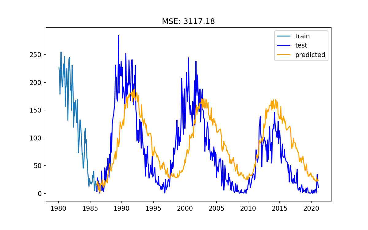
# Fit the best model
best_model = AutoReg(train, lags=all_lags_sorted[:best_lag_order], seasonal=True, period=best_period)
results = best_model.fit()

pred = results.predict(start=test.index[0], end=test.index[-1])
mse = mean_squared_error(test, pred)

fig, ax = plt.subplots()
ax.plot(train['1980':], label='train')
ax.plot(test, color='blue', label='test')
ax.plot(pred, color='orange', label='predicted')
ax.legend()
ax.set_title(f"MSE: {mse:.2f}")
plt.savefig("FinalModel.png")
plt.show()

Key Points
Machine learning can be a black box. Understanding what the tools are doing is very helpful
Data preparation can take a lot of your time, this isn’t unusual
The strategies that we have used here today can be applied to many other models